
In this post, we will see three tips that might help us to create buttons in our applications.
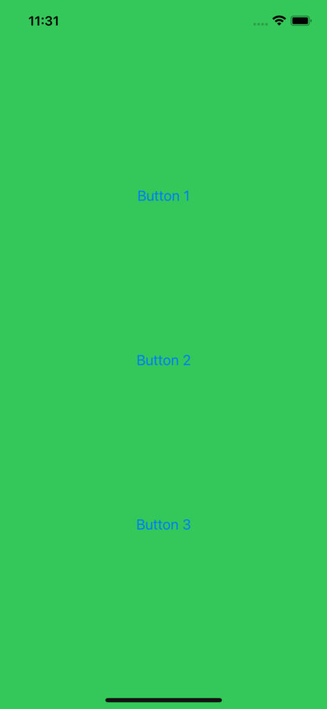
First of all, we open Xcode, we create an iOS project called TestButton and we add three buttons:
import SwiftUI

struct ContentView: View {
    var body: some View {
        ZStack {
            Color.green.edgesIgnoringSafeArea(.all)
            VStack {
                Spacer()
                Button(action: {
                    print("Button 1")
                }) {
                    Text("Button 1")
                }

                Spacer()

                Button(action: {
                    print("Button 2")
                }) {
                    Text("Button 2")
                }

                Spacer()

                Button(action: {
                    print("Button 3")
                }) {
                    Text("Button 3")
                }
                Spacer()
            }
        }
    }
}

struct ContentView_Previews: PreviewProvider {
    static var previews: some View {
        ContentView()
    }
}
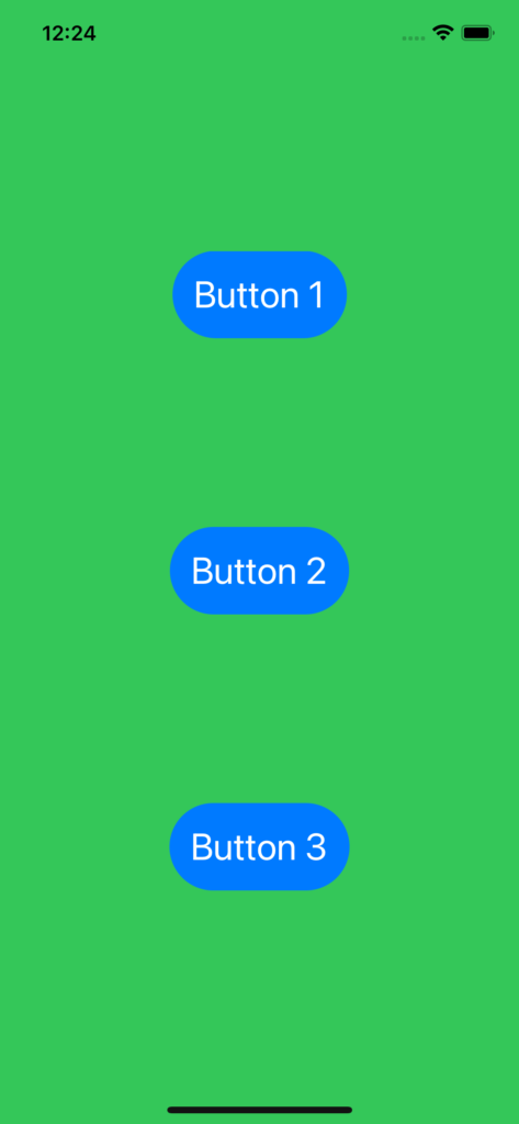
Then, we create a new Swift file called ButtonStyleCustom where we will define the style that we will use for all buttons:
[BUTTONSTYLECUSTOM.CS]
import SwiftUI

struct ButtonStyleCustom: ButtonStyle {
    func makeBody(configuration: Self.Configuration) -> some View {
        configuration.label
            .font(.title)
            .padding()
            .background(Color.blue)
            .cornerRadius(40)
            .foregroundColor(.white)
    }
}
Finally, we will add it at the buttons:
import SwiftUI

struct ContentView: View {
    var body: some View {
        ZStack {
            Color.green.edgesIgnoringSafeArea(.all)
            VStack {
                Spacer()
                Button(action: {
                    print("Button 1")
                }) {
                    Text("Button 1")
                }

                Spacer()

                Button(action: {
                    print("Button 2")
                }) {
                    Text("Button 2")
                }

                Spacer()

                Button(action: {
                    print("Button 3")
                }) {
                    Text("Button 3")
                }
                Spacer()
            }
            .buttonStyle(ButtonStyleCustom())
        }
    }
}

struct ContentView_Previews: PreviewProvider {
    static var previews: some View {
        ContentView()
    }
}
Now, we will see the three tips:
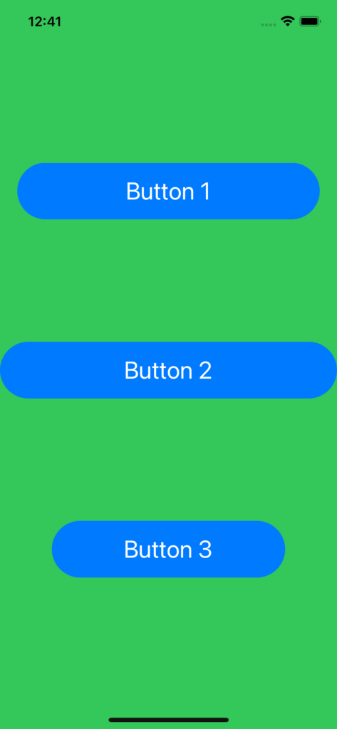
FULL WIDTH BUTTON
import SwiftUI

struct ContentView: View {
    var body: some View {
        ZStack {
            Color.green.edgesIgnoringSafeArea(.all)
            VStack {
                Spacer()
                Button(action: {
                    print("Button 1")
                }) {
                    Text("Button 1")
                        .frame(minWidth: 0, maxWidth: .infinity)
                }
                .padding(.horizontal, 20)

                Spacer()

                Button(action: {
                    print("Button 2")
                }) {
                    Text("Button 2")
                        .frame(minWidth: 0, maxWidth: .infinity)
                }

                Spacer()

                Button(action: {
                    print("Button 3")
                }) {
                    Text("Button 3")
                        .frame(minWidth: 0, maxWidth: .infinity)
                }
                .padding(.horizontal, 60)

                Spacer()
            }
            .buttonStyle(ButtonStyleCustom())
        }
    }
}

struct ContentView_Previews: PreviewProvider {
    static var previews: some View {
        ContentView()
    }
}
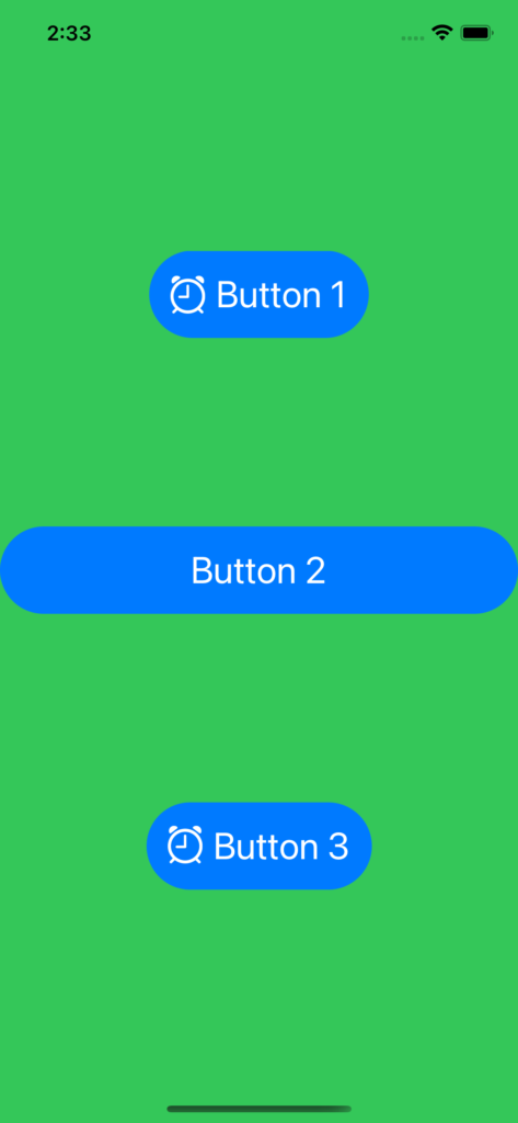
BUTTON WITH IMAGE AND TEXT
import SwiftUI

struct ContentView: View {
    var body: some View {
        ZStack {
            Color.green.edgesIgnoringSafeArea(.all)
            VStack {
                Spacer()
                Button(action: {
                    print("Button 1")
                }) {
                    HStack {
                        Image(systemName: "alarm")
                        Text("Button 1")
                    }
                }

                Spacer()

                Button(action: {
                    print("Button 2")
                }) {
                    Text("Button 2")
                        .frame(minWidth: 0, maxWidth: .infinity)
                }

                Spacer()

                Button(action: {
                    print("Button 3")
                }) {
                    // From iOS 14, we can use Label
                    Label(
                        title: {
                            Text("Button 3")
                        },
                        icon: {
                            Image(systemName: "alarm")
                        }
                    )
                }

                Spacer()
            }
            .buttonStyle(ButtonStyleCustom())
        }
    }
}

struct ContentView_Previews: PreviewProvider {
    static var previews: some View {
        ContentView()
    }
}
CHANGING THE BUTTON STYLE WHEN BUTTON IS PRESSED
import SwiftUI

struct ButtonStyleCustom: ButtonStyle {
    func makeBody(configuration: Self.Configuration) -> some View {
        configuration.label
            .font(.title)
            .padding()
            .background(Color.blue)
            .cornerRadius(40)
            .foregroundColor(.white)
            .scaleEffect(configuration.isPressed ? 0.5 : 1)
    }
}